
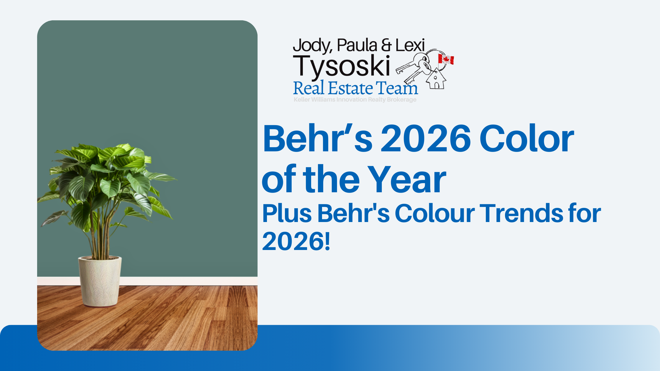
Behr’s 2026 Color of the Year: Hidden Gem
What is Hidden Gem?
-
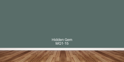
The official 2026 Color of the Year from Behr is Hidden Gem (N430-6A), a smoky jade tone — a blend of blue and green with a subtle gray undertone.
-
It’s described as both calming and energizing — grounding spaces while also giving them personality.
Why Hidden Gem?
-
Behr’s survey research showed a strong desire among homeowners / consumers for colours that are expressive but still serene — colours that don’t overwhelm but also aren’t merely neutral.
-
People responded positively: proportions in the 60-70% range believed Hidden Gem could make spaces feel unique, peaceful, long-lasting.
-
It rides the line between warmth and coolness: a fresh twist on greens + blues, evolving past the dominant sage/olive trends.
How to Use It
-
As an accent: cabinetry, doors, trim. Small spaces or focal elements can benefit from a dose of Hidden Gem.
-
All-over / colour drenching: for those more bold, a room fully lavished in Hidden Gem (walls, ceiling, trim) is possible without it feeling overwhelming, provided finishes & lighting are chosen carefully.
-
Pairing: works well with warm woods, brass hardware, warm neutrals; also complements richer jewel tones for contrast; softer pastels or earthy colours for calm combinations.
Behr’s 2026 Colour Trends Palette & Broader Trends
Hidden Gem does not stand alone; it is central to Behr's 2026 Colour Trends Palette, which reflects broader directions in what people are wanting from their homes.
Here are the key themes and trends:
1. Soulful, Rich & Grounding Colours
-
Deep tones (think jewel tones) are returning, but in a grounded way: less about flashy or saturated, more about elegance and depth. Hidden Gem typifies this.
-
Earth tones also play a strong role: warm tans, browns, clay, ochre-like shades will be used more. These bring warmth and familiarity.
2. New Neutrals & Colour Hybrids
-
Hidden Gem is called a “new neutral” by several sources, meaning it can serve similar roles in design as traditional neutrals but with more personality.
-
Colours that blend the line between categories — blue-greens, smoky tones, warmer neutrals — are going to help people move away from stark grays or plain whites.
3. Softer Pastels Alongside Depth
-
Along with richer tones, softer pastels are in the mix: to add lightness, contrast, or bring calm. These might be used for accents, secondary walls, accessories.
-
The trends palette from Behr includes relaxed pastels among its 20 main trending colours.
4. Warmth, Comfort & Personality
-
There is a desire for spaces that feel comforting but also reflective of personal style. Colours that support that — tones which are rich but not overwhelming, and flexible (accent vs full room) are in demand.
-
People want colours that make them feel rooted, but also expressive; that bring well-being.
What This Means for Designers, Homeowners & Colour Lovers
If you’re choosing colours now (or advising clients), here are takeaways:
-
Don’t be afraid of colour: smoky hues like Hidden Gem show you can move past bland neutrals and still have something timeless and versatile.
-
Use pairing wisely: because Hidden Gem leans both toward blue and toward green, you can lean warm or cool in your accent colours or accompanying materials.
-
Lighting & finish matter more when you’re using these deeper / moodier tones. Matte vs gloss, natural vs artificial light will shift how the colour reads.
-
Use small-scale trials: try it on a cabinet, a door, or one wall before committing across a whole room, to see how it plays with your furniture, flooring, light.
-
Balance is key: richer colours are easier to live with when offset by lighter or neutral surfaces or accessories.
Why 2026 Might Look Different (in Colour Terms)
-
After years of minimalism, cool tones, greys, whites, people seem ready for warmer, richer, more expressive palettes.
-
The continuing desire for calm, refuge and comfort in homes nudges designers toward colours that evoke nature, serenity, groundedness.
-
Hybrid colours (blends, smoky, muted) give flexibility: they can adapt across styles (modern, traditional, eclectic) and not feel “dated.”
Behr’s 2026 Colour Trends Palette
Here are some of the standout shades from Behr’s 2026 Colour Trends Palette, along with how you can use them to refresh your home:
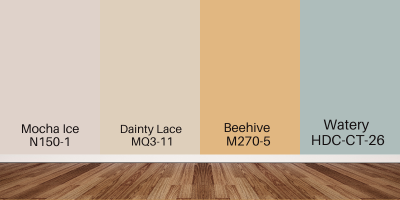
Light & Airy Tones
-
Mocha Ice (N150-1) – A very soft, warm neutral with a faint mocha undertone.
Best used in: ceilings, trims, hallways, bathrooms, or small bedrooms where you want warmth without losing brightness. -
Dainty Lace – A delicate off-white that adds brightness and contrast.
Best used in: trims, ceilings, living rooms, or as a whole-home neutral base to make other colours pop. -
Beehive – A muted golden yellow that feels cheerful and welcoming.
Best used in: kitchens, entryways, breakfast nooks, or sunrooms where you want a touch of warmth and energy. -
Watery (HDC-CT-26) – A soft, pastel blue-green with a calming vibe.
Best used in: bathrooms, laundry rooms, or bedrooms to create a soothing retreat.
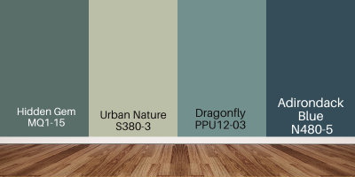
Nature-Inspired Midtones
-
Hidden Gem (N430-6A) – Behr’s 2026 Colour of the Year, a smoky jade that balances between blue and green.
Best used in: accent walls, kitchen or bathroom cabinets, front doors, or entire living rooms for a grounded, elegant feel. -
Urban Nature – A muted green-gray with an earthy, organic character.
Best used in: bedrooms, family rooms, or home offices to create a quiet, nature-inspired atmosphere. -
Dragonfly (PPU12-03) – A jewel-like green with a calming depth.
Best used in: living rooms, libraries, or sunrooms to bring a connection to the outdoors. -
Adirondack Blue – A clear, stable mid-blue with timeless appeal.
Best used in: laundry rooms, bathrooms, or cabinetry for a classic touch.
Warm & Earthy Shades
-
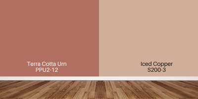
Terra Cotta Urn – A rich, earthy red-orange with rustic warmth.
Best used in: dining rooms, accent walls, fireplaces, or outdoor living spaces like patios. -
Iced Copper (S200-3) – A warm, copper-inspired tone with richness.
Best used in: feature walls, fireplace surrounds, or as an accent colour in kitchens and living rooms.
Bold & Dramatic Colours
-
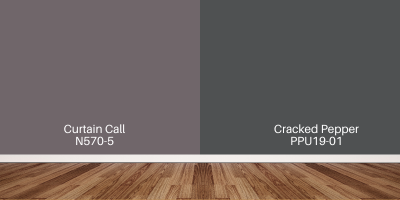
Curtain Call – A moody plum with jewel-like depth.
Best used in: powder rooms, dining rooms, or on statement furniture for a luxurious touch. - Cracked Pepper – A near-black charcoal tone with sophisticated contrast. Best used in: accent walls, kitchen islands, interior doors, or trim to make lighter colours stand out.
Bringing Colour Into Your Home in 2026
From the bold richness of Hidden Gem to the versatile tones in Behr’s 2026 colour trends, this year’s palette is all about balance—pairing personality with timeless appeal. Whether you’re looking to make a statement with jewel tones, soften your space with airy neutrals, or add warmth with earthy hues, there’s a shade to suit every style and every room in your home.
Colour is one of the simplest yet most powerful ways to transform a space. If you’re thinking about refreshing your home in Brantford, Brant County, or anywhere in Ontario, this year’s palette offers endless inspiration. Start small with an accent wall or go bold with a full-room makeover—the key is choosing colours that reflect your lifestyle and create a home you love.